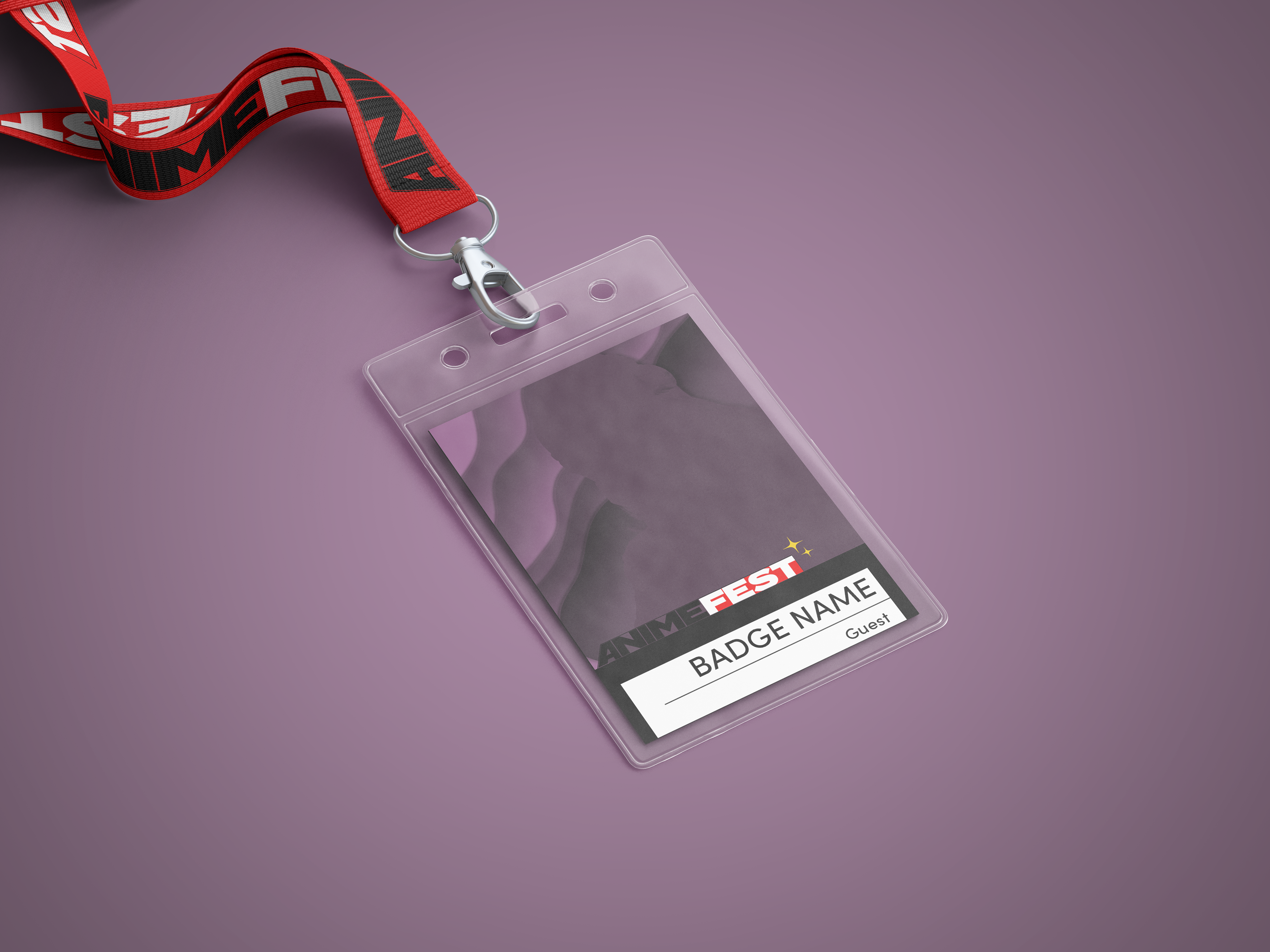
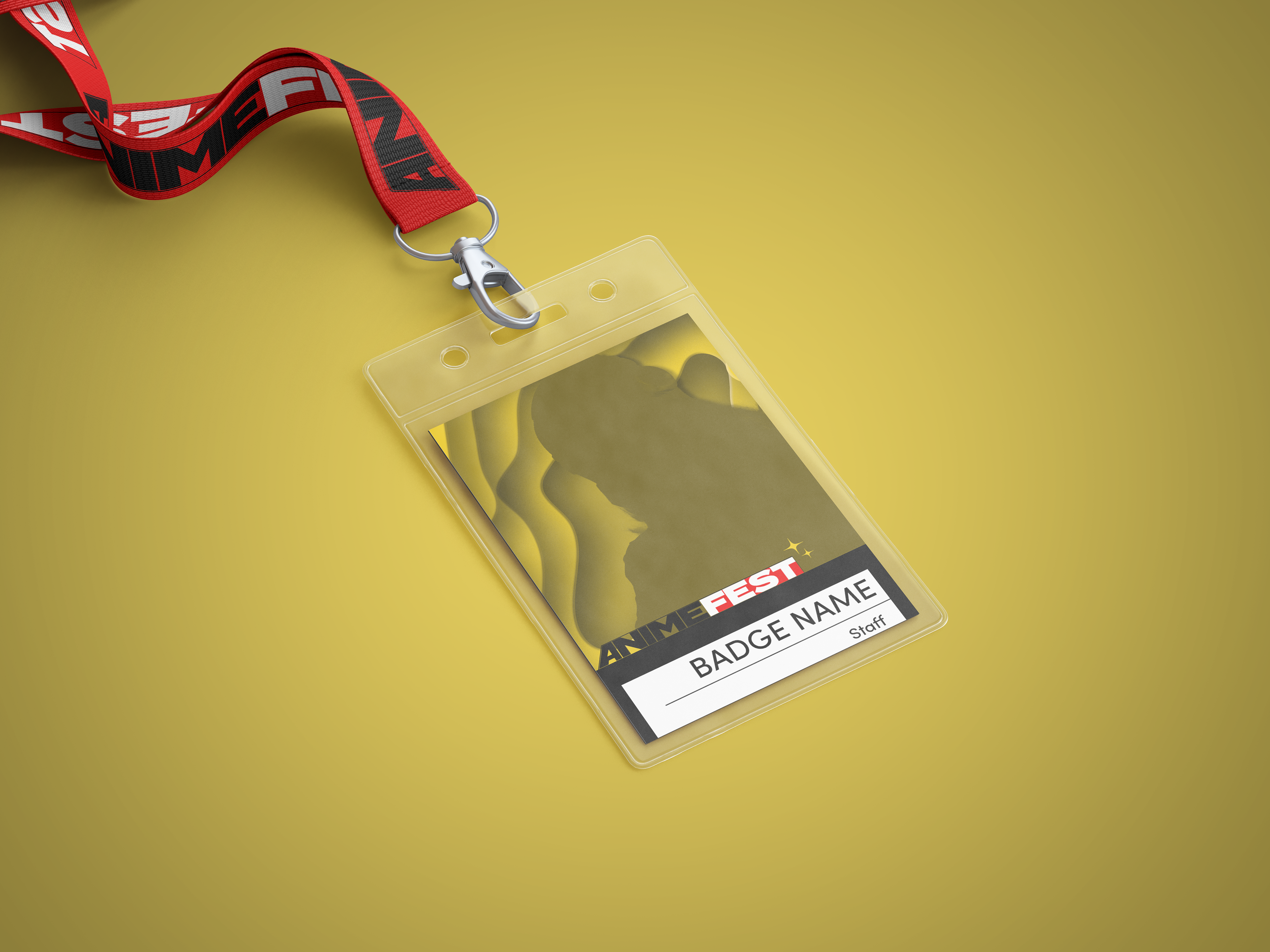
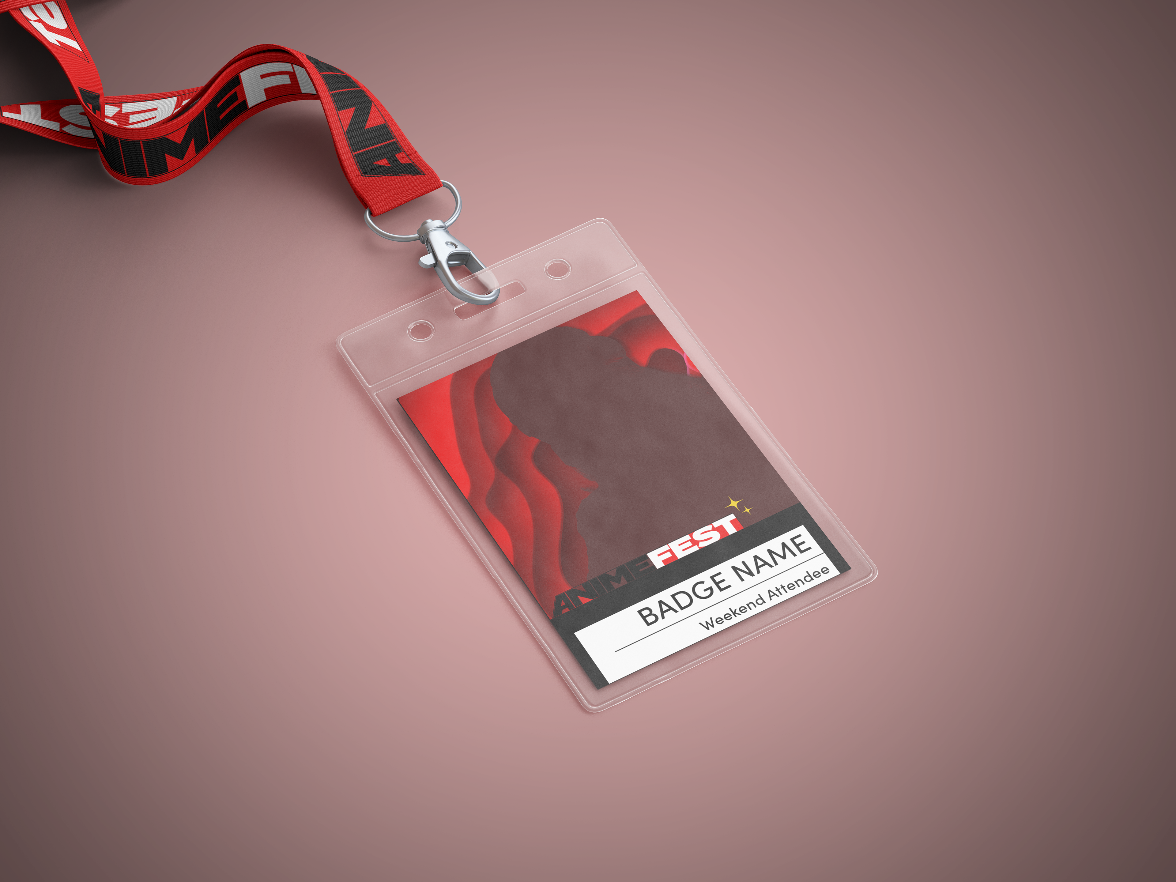
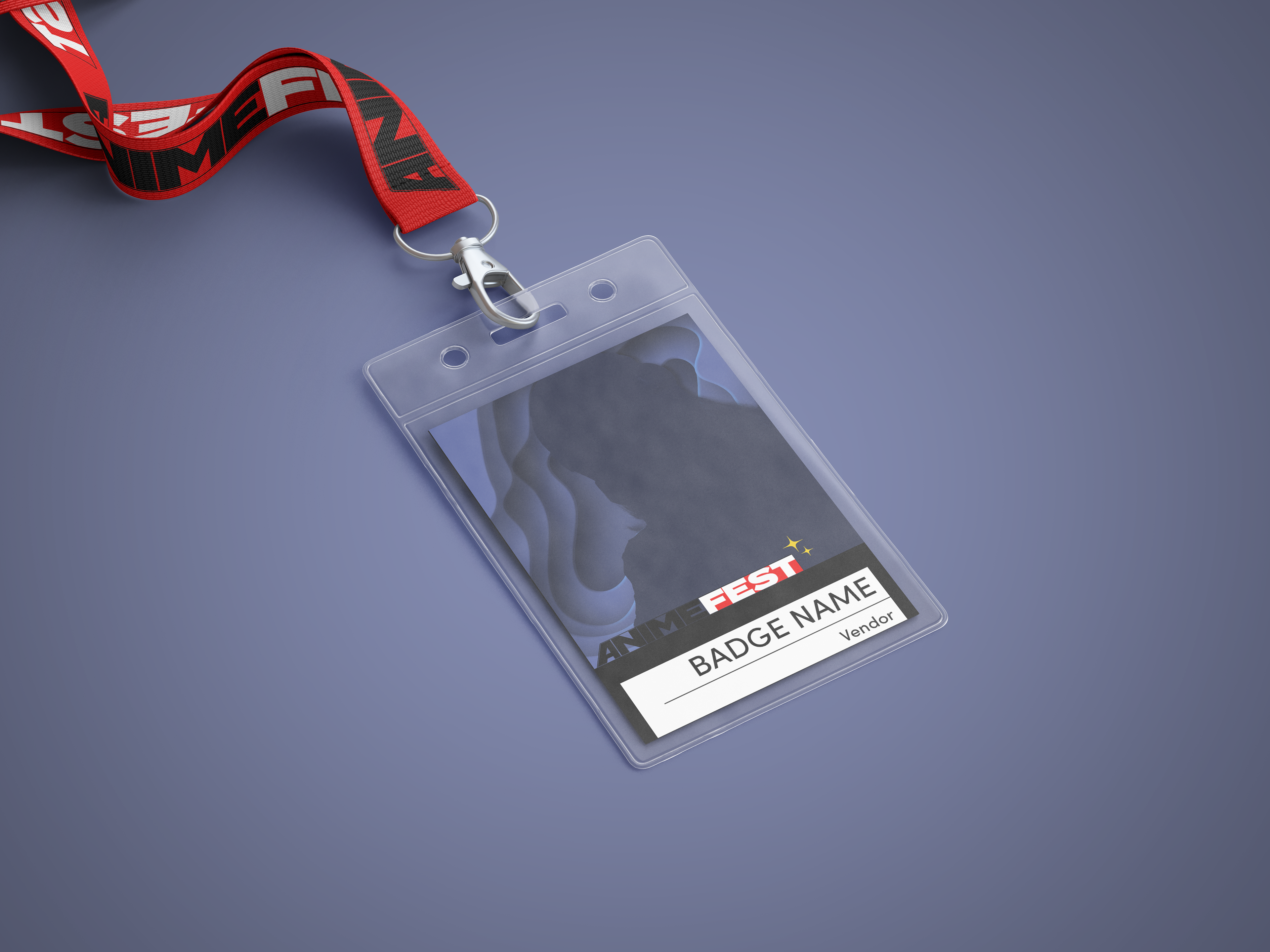
Project Summary
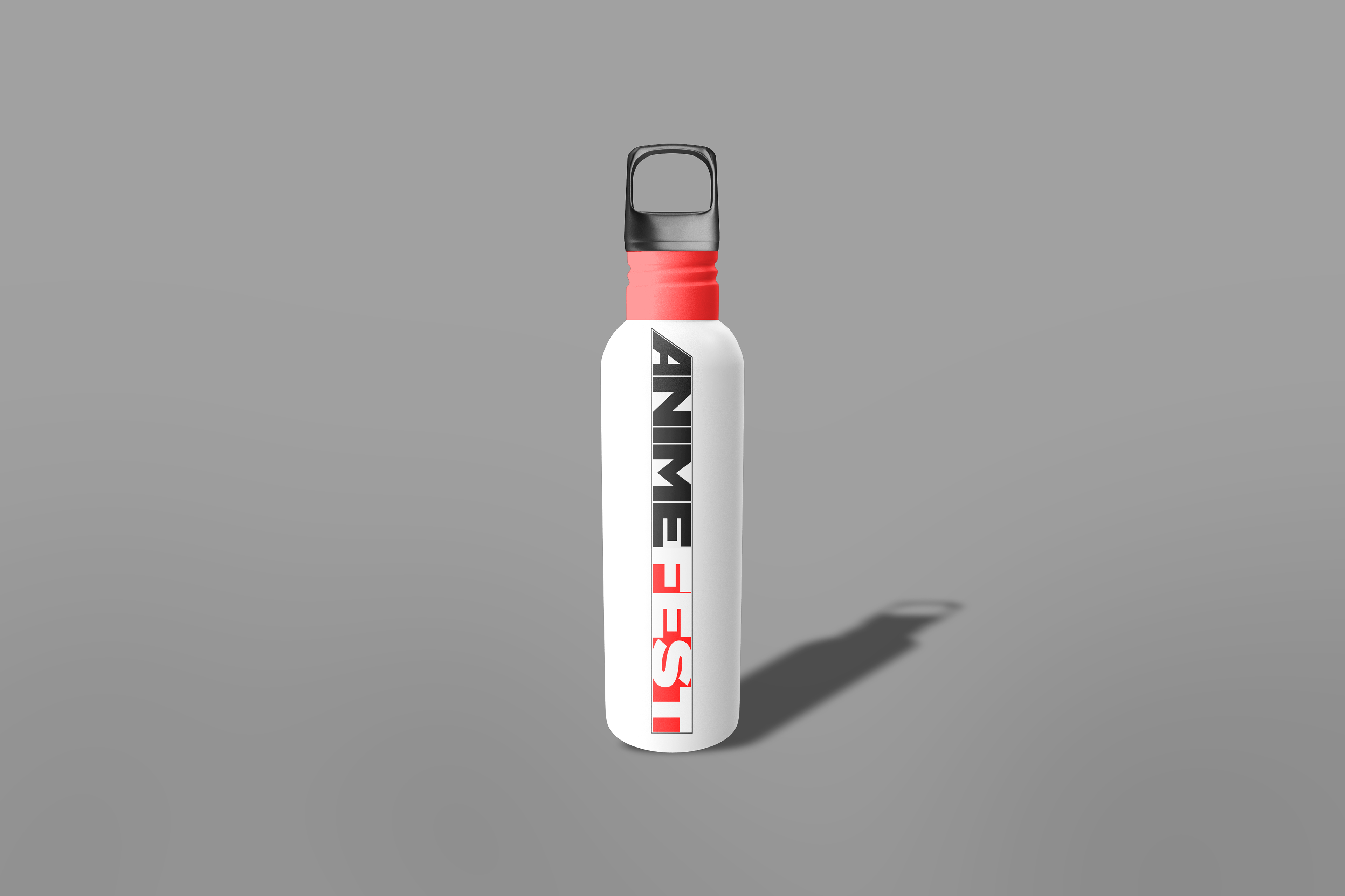
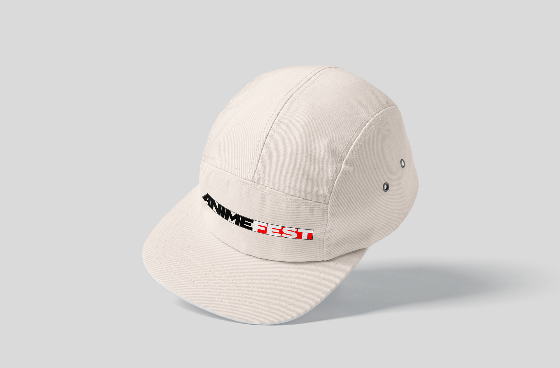
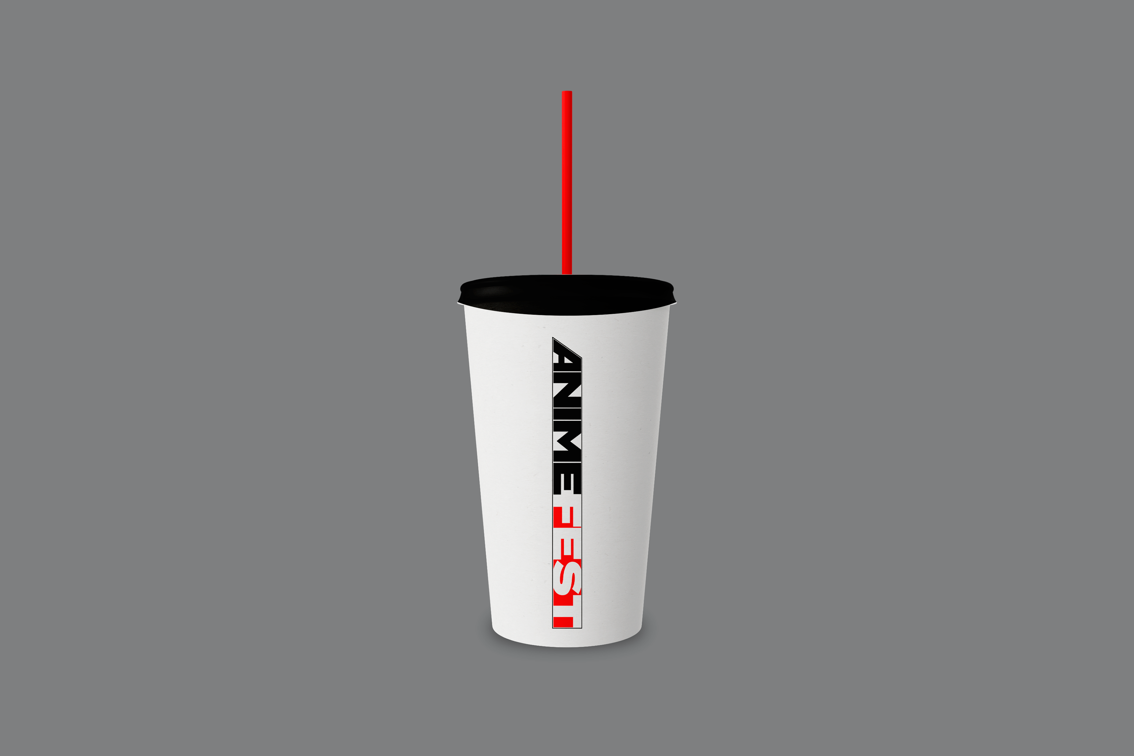
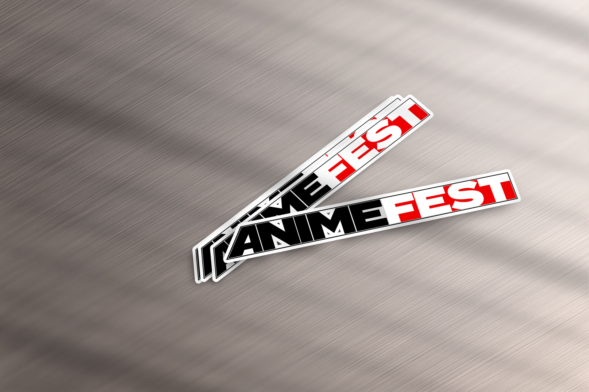
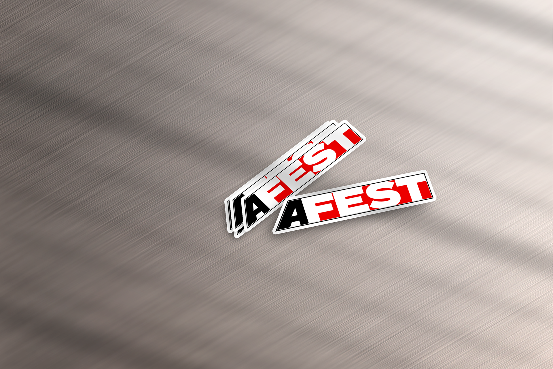
This project is about redoing something very near and dear to my heart. Animefest was the first convention I ever attended in the 7th grade and have continued to attend every year since. Because of it, I have made a lot of friends - one of which is my roommate now. When I look at all the conventions around me rebranding and modernizing their brand, it felt like Animefest needed to have the same love and dedication given to it. So, I took it upon myself to do it for my capstone. There are lots of inspirations here, most of which are the logos from hundreds of others conventions around the country to try to get a feel. I wanted it to be clean, bold, and fun. Simple but recognizable enough. I wanted it to be something that is modern and will be able to be used for years to come. I looked at different brands as well who use bold accent colors and in general logos I liked and felt matched the aesthetics and vibes I was going for in my design. I’ve used mostly Photoshop and Illustrator to bring to life my ideas.
Logo Planning and Brand Ideals
Current Logo:
Animefest should be:
> fun
> creative
> friendly
> exciting
> unique
TERMINA BLACK
ABCDEFGHIJKLMNOPQRSTUVWXYZ
abcdefghijklmnopqrstuvwxyz
Sofia Pro
ABCDEFGHIJKLMNOPQRSTUVWXYZ
abcdefghijklmnopqrstuvwxyz
